Step 1: Project Overview
The goal was to create an optimized e-commerce platform for selling a wide range of children's toys, categorized by age, gender, and interest.
Target Audience:
Parents, guardians, and gift buyers looking for a reliable and fun online shopping experience to purchase toys for children.
Step 2: Roles, Key Values, and Contributions
Designer: Responsible for crafting the overall user interface, ensuring intuitive navigation, and incorporating a playful yet professional aesthetic suitable for an e-commerce site selling children's toys.
Developer: Implementing the design using modern web technologies to ensure responsiveness and functionality.
Product Manager: Aligning the design with business goals and customer expectations.
Key Values:
01
Playful yet professional.
02
Easy to navigate and user-friendly.
03
Optimized for mobile and desktop platforms.
04
Highlight product variety and deals clearly.
Сontributions:
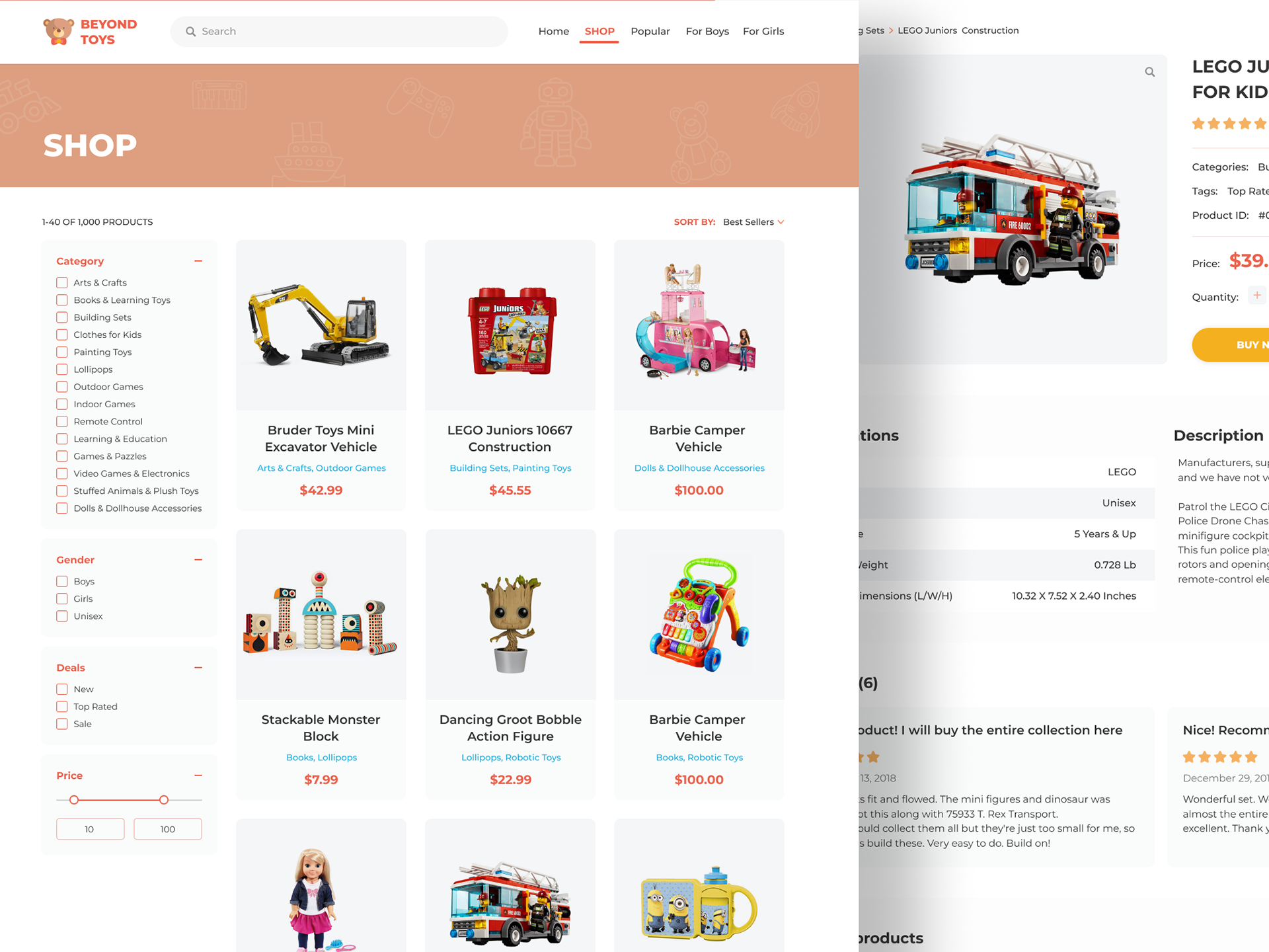
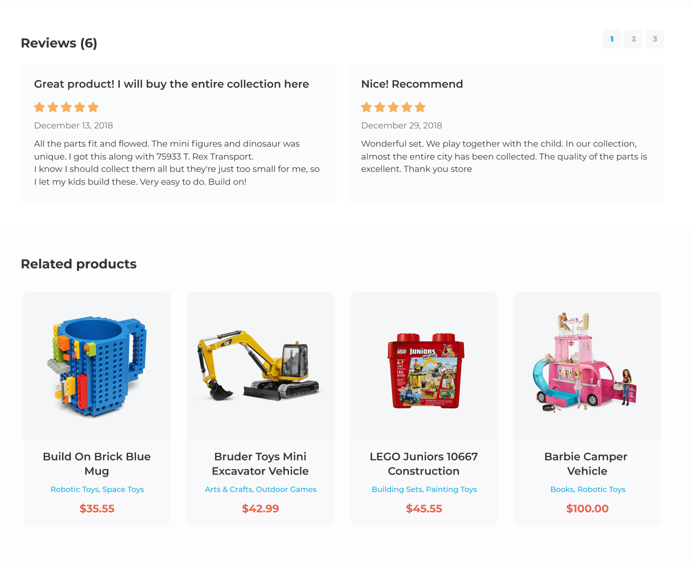
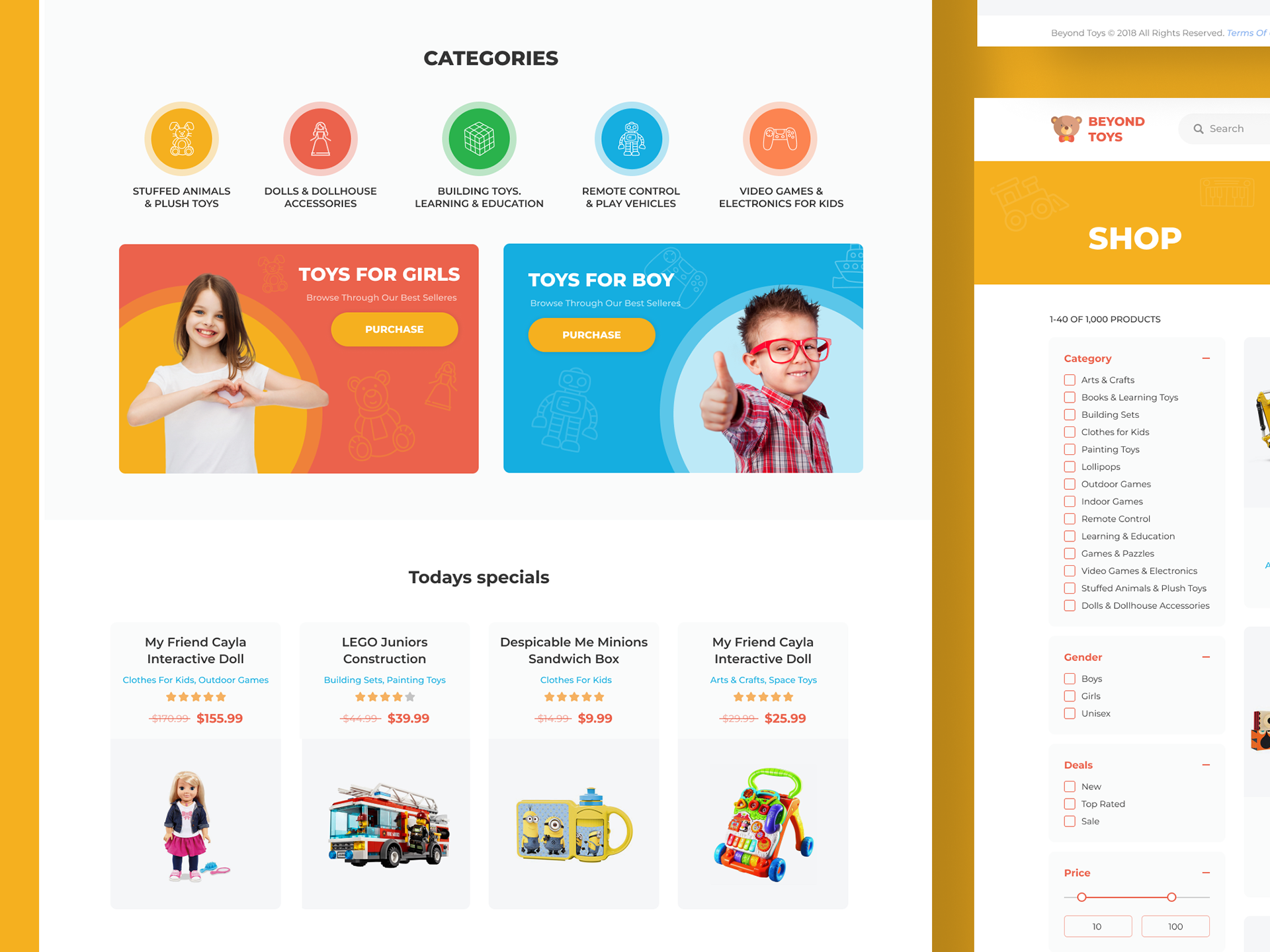
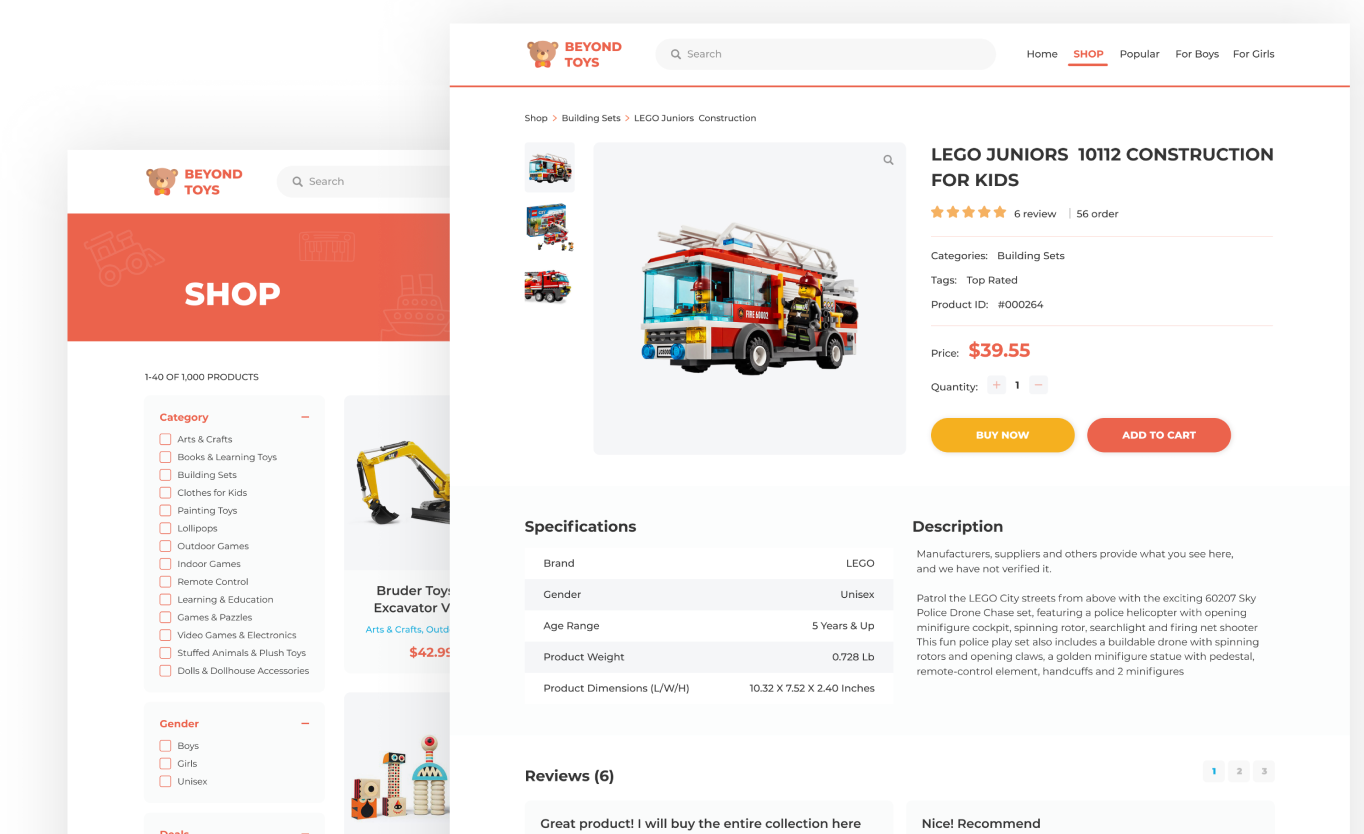
Created wireframes, mood boards, and high-fidelity prototypes. Designed the UI layout, including interactive product listings, category filters, product details, reviews, and an optimized checkout flow.
Step 3: Problem and What We’re Trying to Solve
Problem:
The existing site had a cluttered interface, making it difficult for users to find products. The navigation was unintuitive, and the visual design didn't reflect the fun, engaging nature of the products sold on the platform.
Solution:
The redesign simplified the user journey by restructuring the navigation, adding clear categories, and incorporating a clean, playful design aesthetic. The new interface highlights the products in a visually appealing way, while still maintaining functionality.
Step 4: Design System and What It Solves
The design system introduced a warm color palette with playful iconography, aimed at invoking a sense of joy and excitement. The typography was chosen for readability and to ensure clarity across devices.
Typography:
Bold, easy-to-read typefaces for product names and descriptions.
Color Palette:
Bright, inviting colors such as oranges and greens were used to create a playful tone, while white and grey were used for a clean, professional look.
Grid Layout:
A flexible, grid-based structure was implemented to ensure that the design would be responsive across devices, making it easy to browse on mobile, tablet, and desktop.
Key Features Resolved:
Simplified search and filter system to help users find products faster.
Detailed product pages showcasing product specs, reviews, and related products.
Engaging call-to-action buttons (Buy Now, Add to Cart) placed prominently.
Improved product categorization and filtering for seamless browsing.

Step 5: Final Conclusions
The redesign led to a significant improvement in user engagement metrics, such as a lower bounce rate and higher conversion rates. Users were able to find products quicker, and the playful design was well-received by both the client and customers.
Quantifiable Benefits:
Bounce Rate: Decreased by 15% within the first month after the redesign.
Conversion Rate: Increased by 20% after launch.
Mobile User Experience: 30% faster load times on mobile devices, with an improved mobile-first design approach.
Visual Outcomes:
The vibrant, kid-friendly design combined with the intuitive structure led to a more positive shopping experience, ultimately increasing customer satisfaction.
Do you like this project? Do you need a new one? Let's start our process right now!