Step 1: Project Overview
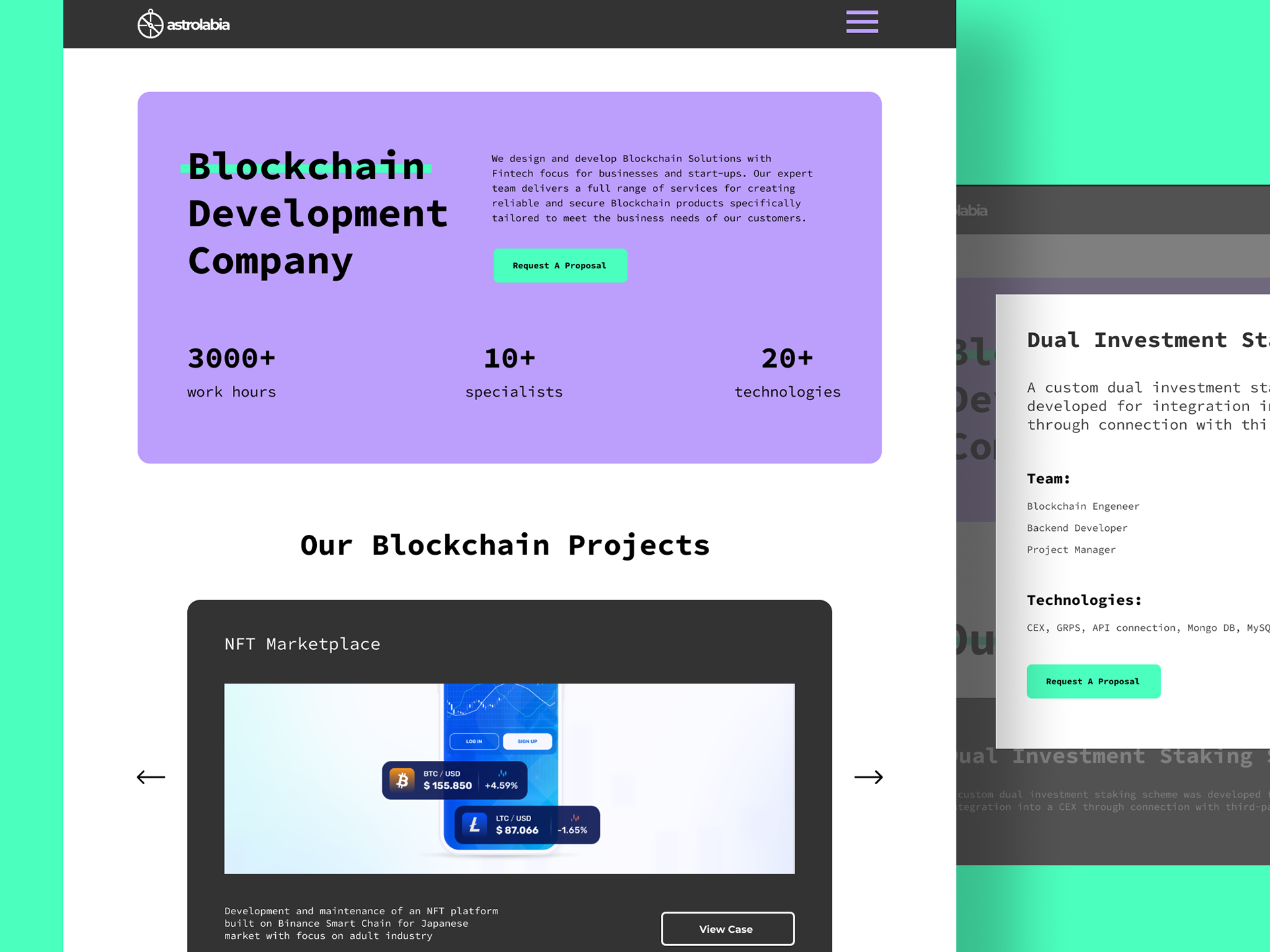
The goal of this project was to create a modern and engaging website for Astrolabia, a company specializing in blockchain solutions with a strong focus on fintech. The website needed to highlight the company's services, showcase its technical expertise, and attract potential clients by presenting past blockchain projects and services in an easy-to-navigate, professional format.
Main Goals:
01
Present Astrolabia's capabilities in blockchain technology and fintech development in a visually compelling and professional manner.
02
Highlight key blockchain projects to demonstrate the company’s experience and expertise.
03
Facilitate lead generation through clear calls-to-action, inviting users to request proposals or learn more about Astrolabia’s services.
Target Audience:
The target audience consists of businesses and startups looking for blockchain solutions, particularly those in the fintech space. These companies seek reliable partners to help develop and integrate blockchain technology for their platforms.
Step 2: Roles, Key Values, and Contributions
Roles Involved:
Lead Designer: Responsible for creating the overall visual design, UI/UX layouts, and ensuring the brand’s message was clearly communicated through the design.
Developer: Tasked with implementing the website design, ensuring smooth transitions, responsive behavior, and functionality across all devices.
Project Manager: Coordinated the design and development teams, ensured deadlines were met, and managed client expectations.
Key Values:
Clarity and Simplicity: The design emphasizes a clean, straightforward structure that makes it easy for visitors to navigate and understand the company's offerings, with a focus on concise communication of complex technologies.
Professionalism: The minimalist design, combined with strong typography and structured sections, conveys the company's technical expertise and reliability in the blockchain and fintech space.
Engagement: The use of bold colors and interactive elements such as hover states and calls-to-action (CTAs) creates an engaging experience, guiding users toward taking action (e.g., requesting a proposal).
Сontributions:
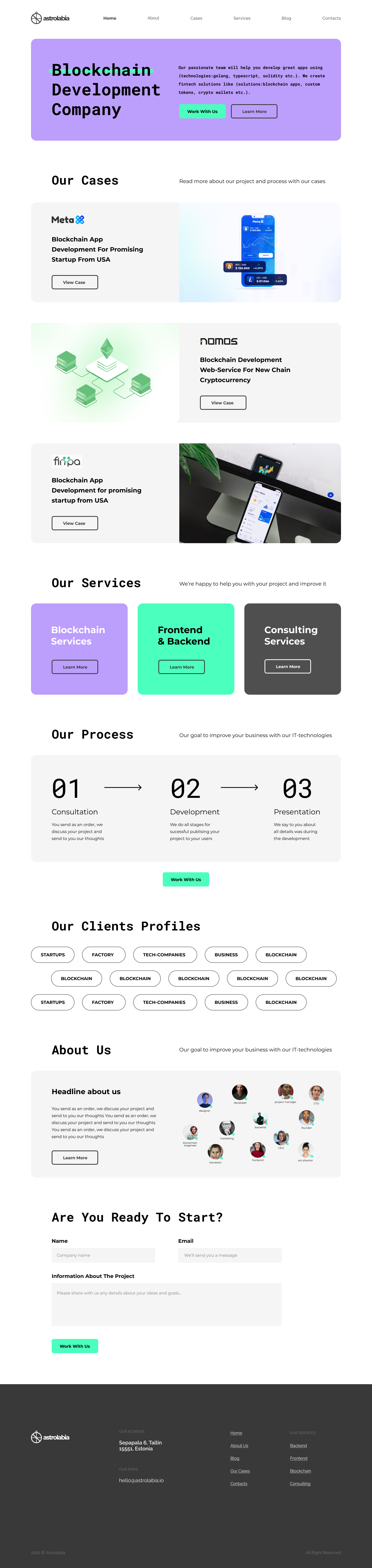
Designed a layout that highlights Astrolabia’s technical expertise in blockchain technology, showcasing case studies and relevant projects in a visually appealing format.
Developed a cohesive color scheme and typography that reflect the company’s professionalism and innovation.
Integrated responsive elements to ensure a seamless experience across devices, making the website accessible to both mobile and desktop users.
Step 3: Problem and What We’re Trying to Solve
Identified Problem(s):
Astrolabia, as a blockchain development company, needed a website that effectively communicated the breadth and complexity of its services without overwhelming potential clients. The challenge was to create a design that simplified the presentation of technical services such as backend, frontend, blockchain, and consulting, while still demonstrating the company’s high level of expertise and encouraging visitors to engage with the company for business inquiries.
Solution Implemented in the Design:
The design focused on breaking down complex services into digestible, easy-to-understand segments while maintaining a professional and clean visual aesthetic.
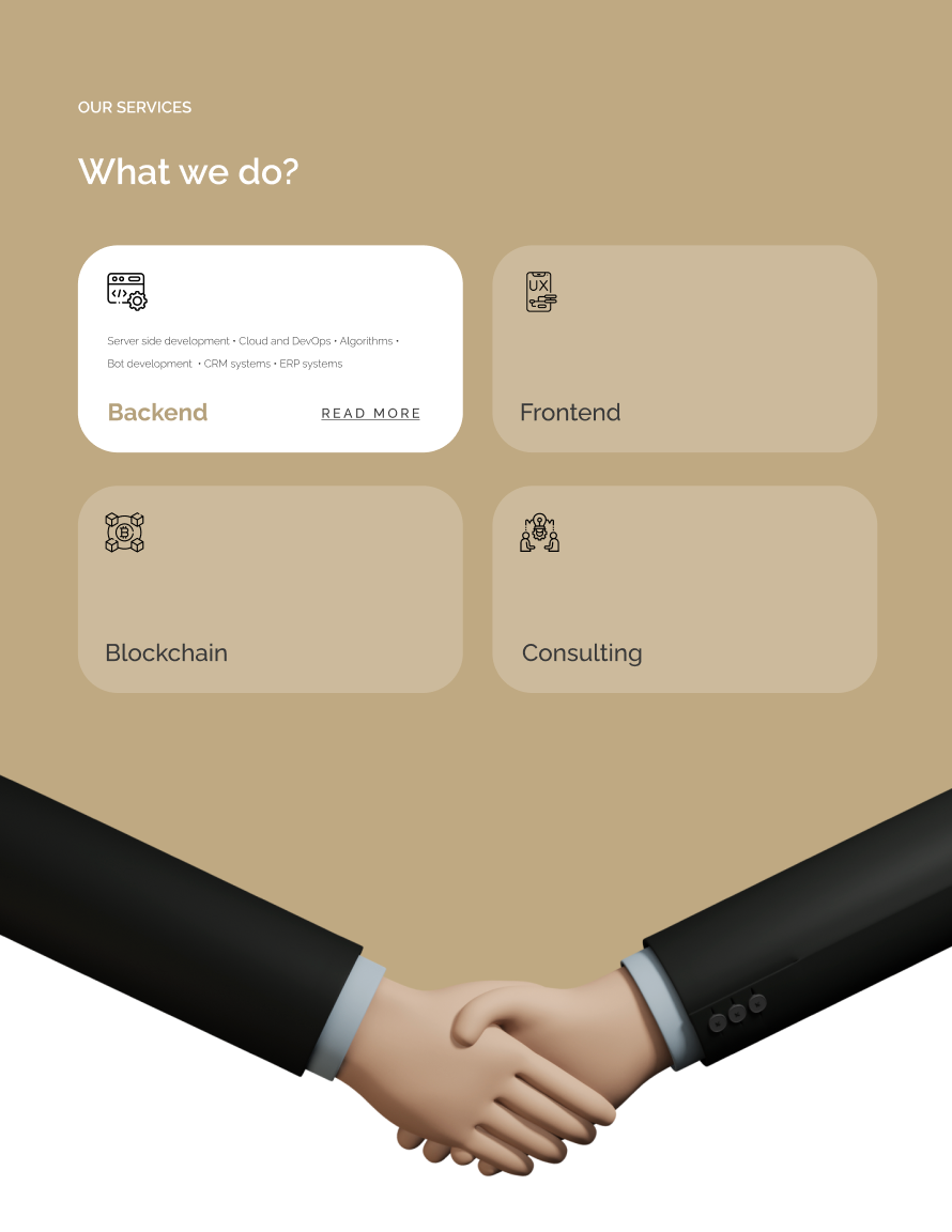
Service Categorization: The services were divided into distinct categories (Backend, Frontend, Blockchain, Consulting) with simple, clear descriptions. Each category is represented by icons and short summaries to make it easy for users to understand the offerings at a glance.
Interactive Elements: Key services include “Read More” options, allowing users to dive deeper into details if they are interested, rather than overwhelming them with too much information at once. This keeps the site clean and engaging.
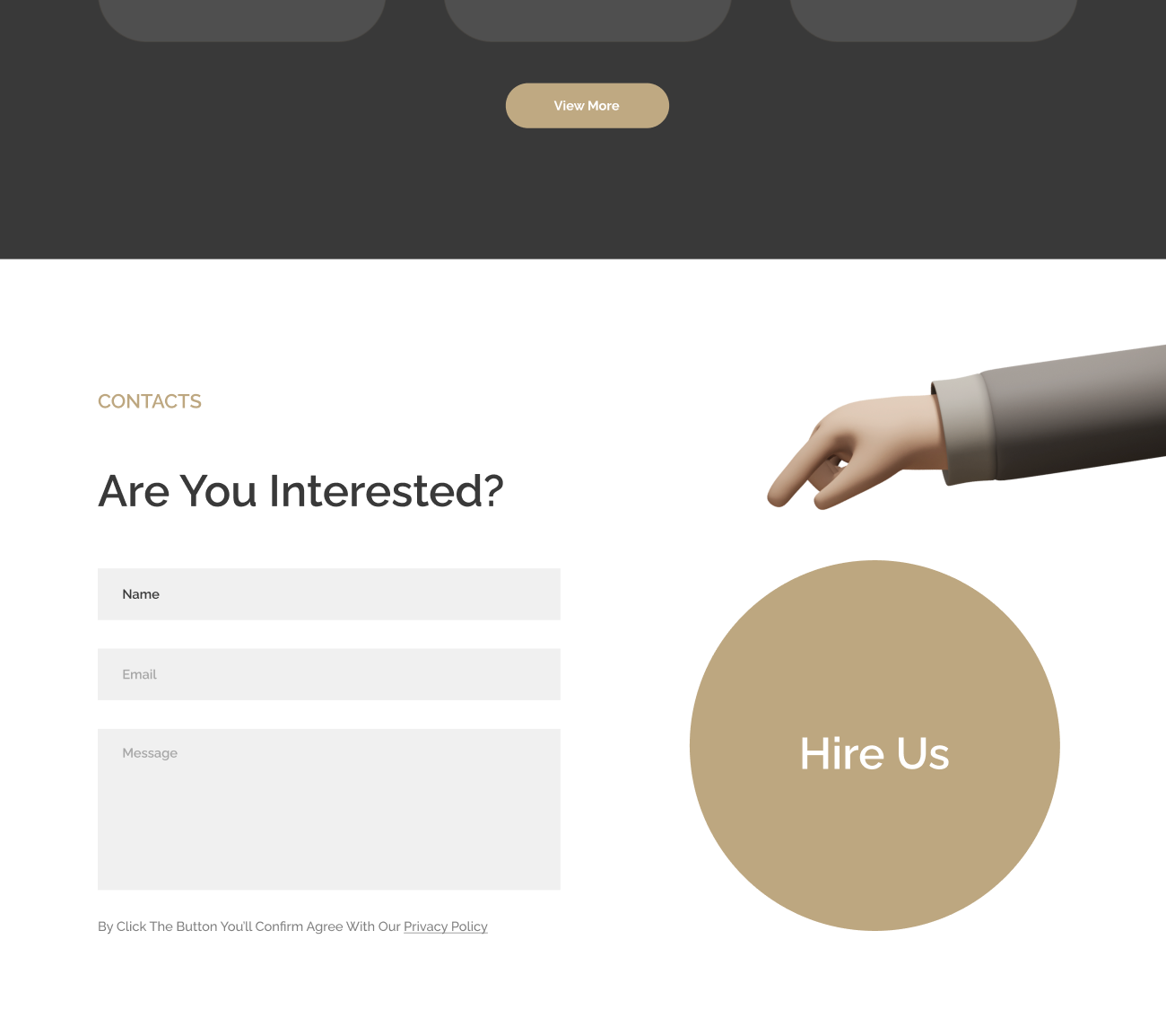
Strong Calls-to-Action (CTA): The contact form and the large “Hire Us” button are prominently featured, making it easy for visitors to reach out for inquiries. The use of a handshake graphic visually represents partnership, adding a friendly touch to the professional tone.
Visual Hierarchy: Through a well-organized layout and use of visual hierarchy, the design draws the visitor’s attention to key sections such as services, portfolio, and CTAs, ensuring a clear path for users to navigate the site.

Step 4: Design System and What It Solves
In this section, the design system used for Astrolabia’s website played a crucial role in enhancing user experience, promoting engagement, and maintaining consistency across all pages. Here's how the design system contributed to solving user pain points:
Color Palette:
The website utilizes a professional, neutral color palette with contrasting accents. Earth tones and shades of beige, combined with black and white, are used to maintain a sleek and professional look, while strategic pops of color (like green for CTAs) guide the user's attention.
This ensures a clean interface that isn’t visually overwhelming, allowing the technical information and content to stand out clearly.
Typography:
Large, bold fonts for headers immediately draw the user's attention to key sections such as services and CTAs. The chosen fonts are modern and easy to read, making it simple for users to digest technical details about the services.
Smaller, lighter text for body content helps maintain readability and keeps the overall design feeling clean and organized.
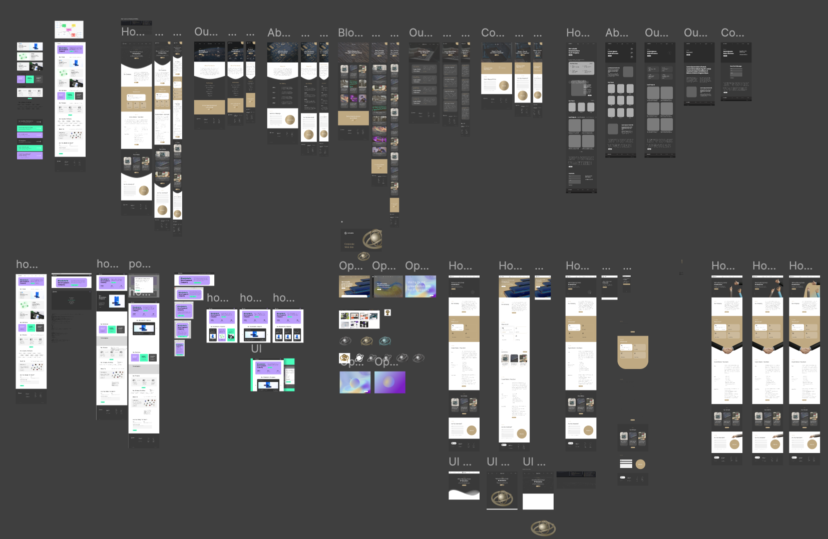
Layout and Grid System:
A well-defined grid system was employed, as shown in the wireframes, to ensure consistency and alignment across all pages. This makes the website feel structured and easy to navigate.
The layouts guide the user's journey through the homepage, service categories, and contact form, ensuring that the most important information is easily accessible.
Icons and Visuals:
Custom icons were created for each service category (Backend, Frontend, Blockchain, Consulting) to help users quickly identify the different offerings. These visuals enhance the clarity of complex technical terms, making the site more approachable for all types of users.
The handshake graphics and pointing hand add a friendly, engaging touch to the otherwise professional design, making the overall user experience feel more welcoming.
Responsive Design:
The wireframes and design ensure responsiveness across various devices. The layout adapts seamlessly for mobile and desktop use, ensuring a smooth experience regardless of screen size. Key elements like CTAs and service categories remain prominent and easy to access on smaller screens.
What It Resolves:
Improved Navigation: The structured grid system and clear hierarchy ensure that users can find the information they need quickly and easily.
Enhanced Readability: By choosing modern, clean typography and simplifying complex content into bite-sized segments, the website ensures users can understand the services without feeling overwhelmed.
User Engagement: The bold CTAs, accompanied by intuitive icons and interactive elements, increase the likelihood of users engaging with the site, either by requesting a proposal or reaching out through the contact form.
Step 5: Final Conclusions
The design for Astrolabia successfully addressed the company’s need for a modern, professional, and approachable website. Through the use of a clear design system, the website effectively communicates complex blockchain and fintech services while maintaining an easy-to-navigate structure.
The inclusion of interactive elements, strong visual hierarchy, and clear CTAs helped boost user engagement and simplified the process for potential clients to reach out. Although specific metrics or user feedback are still to be gathered, the website sets a strong foundation for increased user interactions and business inquiries.
Do you like this project? Do you need a new one? Let's start our process right now!